Most of us are familiar with the saying, “You never get a second chance to make a first impression.” And while it may sound cliché, this is actually an adage that can be applied to many things in life – including the website you create for your startup business.
Regardless of the size of your new business, your industry, or the products or services you’re trying to sell, a startup website is non-negotiable. Today’s consumers spend more time than ever in the digital world, making it vital that your business makes a place for itself online. But even if you’re already well-aware of the necessity of a business website, as well as the basic elements that yours should include, actually getting started can feel like a monumental task.
How to Build a Startup Website that Works
The best startup websites don’t just cover the basics of their business; they do so with a highly effective design that sets them apart from their competition. Research from the Neilson Group shows that users typically spend just 10 to 20 seconds on a webpage before clicking away, which means that you have a tiny window of time to grab their attention, deliver your message, and make an impact. So, how do you build a startup website that gives your business the best chance of success?
First and foremost, keep in mind that the people arriving on your webpage likely have very little understanding of who you are or what you do. As a brand-new business, you’re still building brand recognition. This means that your primary goal should be to clearly communicate your value proposition and do so in a visually pleasing and distinctive way.
One of the best ways to figure out how to do that is to take a closer look at the best business websites that are currently online, the ones that have executed a first-rate site that effectively leave a lasting impression. As you’d imagine, every successful startup website is completely unique – however, there are some common denominators that can be hugely helpful when you’re building yours.
The Best Startup Websites Online Now
In the world of business, the value of learning from your fellow entrepreneurs should never be underestimated. So, to spark some inspiration and help you begin building a formula for a solid startup site, we’ve put together a list of our favorite startup websites.
These startups come from a diverse range of industries and boast a massive variety of visual designs, but the one thing they have in common is that they make a knockout first impression. From effective execution to impressive design, here are our picks for the top startup websites out there.
Exposure
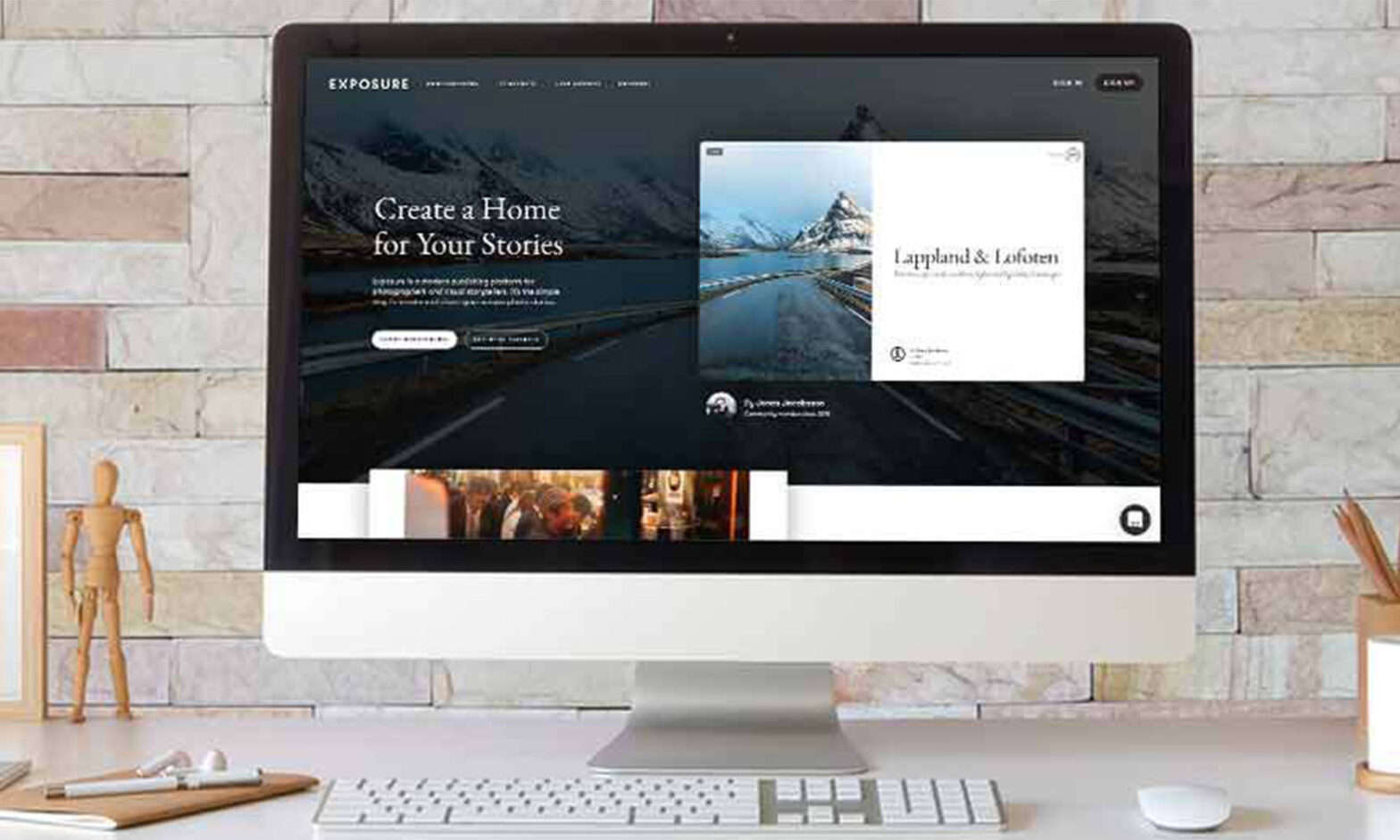
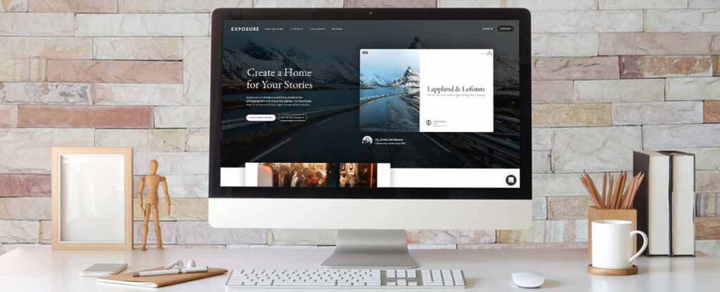
Exposure describes itself as “a modern publishing platform for photographers and visual storytellers,” so it’s immediately clear who their target audience is. And from the moment you arrive on their site, it’s easy to see that they’ve aimed for a design that will specifically speak to creatively-minded users.
Overall, the design itself is fairly simple and straightforward, which allows the focus to be on the photographs. There isn’t excessive text cluttering up the home page, and the visual setup is an excellent preview of the custom sites they offer as a service. You can immediately see the potential of the product Exposure has created, both through the site itself and the example pages (from real clients) that they make accessible.
Exposure’s value proposition is wrapped up in aesthetically-pleasing packaging and virtually hand-delivered to the user, leaving no question as to why this is a startup that’s worth watching.
CloudApp
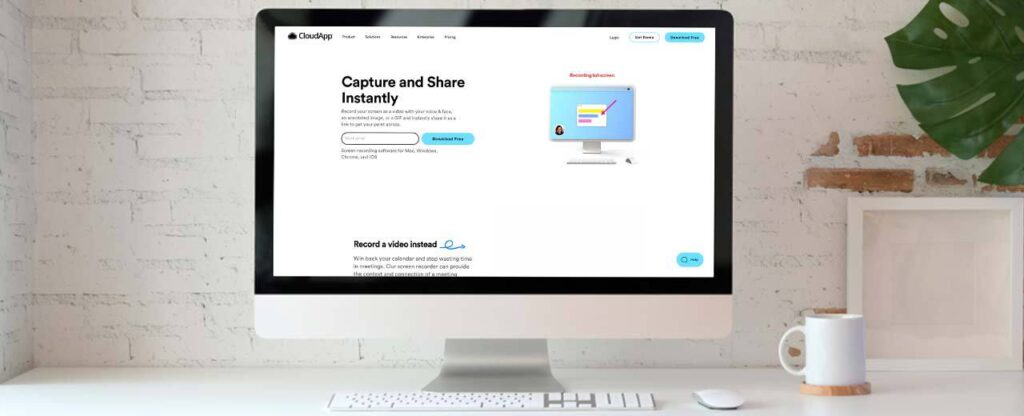
CloudApp is a screen-recording software that promises to be the solution you need to streamline a wide range of workplace communications – and their website makes that clear from the get-go. The descriptive text is to-the-point but highly effective, summarizing what the product is and why it’s valuable. Also featured on the home page are short animations that demonstrate the software in action, giving the user a preview of how it can transform their everyday work routines.
As you browse the CloudApp website, you can see that they have an excellent grip on what makes their product special. And not only that, but they’ve also done an exceptional job of communicating the benefits of their software in a way that doesn’t feel too “sales-y” but rather comes across as completely authentic.
BuildZoom
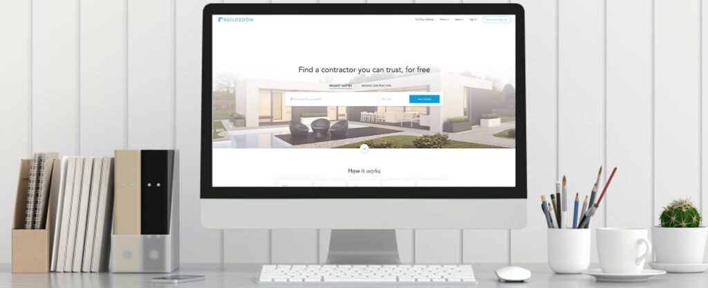
The concept of BuildZoom isn’t necessarily new, but where this startup excels is in its ability to make the user experience significantly smoother than its competitors. From the point of arrival, the user can immediately deduce the purpose of BuildZoom – you simply enter the home improvement service you need and your zip code, and the service will provide you with vetted recommendations. The website is built for such easy navigation that, ultimately, it leaves the user wondering: “Why not try BuildZoom?”
Much like the user experience, the visual design of this site is simple, clean, and without any unnecessary fuss. A quick scroll gives you a substantial amount of information about how BuildZoom works, examples of contractors they can connect you with, and specific data that illustrates why they’re the best at what they do. Plus, there are plenty of CTA (call to action) points, so the user is never far from the opportunity for conversion.

Berrydivine
When the Berrydevine website loads, you know exactly what you’re there for: fresh and delicious acai bowls and other healthy options. An oversized photo puts their product front and center, showing off the vibrant colors of Berrydevine’s appetizing acai bowls. This is definitely a case of a picture being worth a thousand words and an outstanding example of knowing where your brand’s best strengths lie.
Users’ attention is captured right away, and the simple navigation set-up ensures that they can explore the website easily. At the top, a navigation bar highlights the key elements of a startup site: the brand story, how to actually purchase the product, and what the product is. Additionally, an “Order Online” button catches the user’s eye because it is designed with a contrasting color that’s noticeable yet complementary to the overall site.
Xero
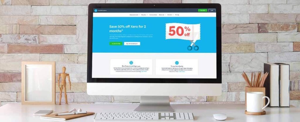
An online accounting software aimed at small business owners, Xero has a webpage that’s equal parts informative and attractive. The design is clean and modern, structured in such a way that breaks text into easily-digestible bits. Because Xero needs to tell potential users a considerable amount of information about their product, presenting it in an organized manner is crucial.
The aesthetic of the website is flawlessly aligned with the design of the Xero accounting software, giving the audience an immediate feel for the brand’s identity. Like several of the other sites we’ve covered, the opportunities for taking action are plentiful: there are “Get Started” buttons throughout the home page, and a floating “Free Trial” button puts conversions within easier reach.
Overall, the home page answers the majority of questions a new potential customer would have – and it does it in a way that positions Xero as the ideal solution.
Limepay
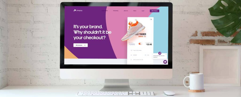
Limepay is a B2B (business to business) brand that facilitates payment platforms for various retailers. Their website is an outstanding example of high-impact design, from the color scheme to the three-dimensional feel created by the layout. The scrolling animations deliver bite-sized chunks of information in an engaging manner, combining text and images with skill.
Like many modern startup websites, Limepay also features a chatbot for users to interact with as needed. With a tool like this, online users can get immediate answers to their questions, be directed to the right page, or even be connected to a live representative that can help them. The result? You’re able to demonstrate that your brand has a commitment to quality service from the very beginning.

Donut
The Donut app is designed to help users discover new ways to explore financial investment. Their website immediately illustrates that this isn’t just any other investment app – Donut is intended to put a modern twist on the typical options already available.
With a minimalistic design that doesn’t shy away from creative elements, Donut’s site packs a powerful punch of personality in a completely uncluttered form. And best of all, the website has more than just good looks; it also packages up key information about the product in easy-to-understand sections.
Within minutes, the user has a detailed understanding of what Donut is, why they should download the app, and what they’d be missing out on if they don’t.

Duolingo
Learning a new language can be fun – at least, that’s what the Duolingo app advertises. And as you browse their website, you’re likely to find yourself agreeing that if any program can make learning a second language enjoyable, it’s this one. With a friendly and fun aesthetic, Duolingo’s site incorporates visuals that have a quirky quality without going overboard on the “cute factor.”
At the very top of the home page, a “Get Started” button jumps out at the user. The structure of the home page creates the sense of a highly simplified landing page, which serves the purpose of funneling users in the right direction. If a user opts to scroll down instead, they’re presented with a variety of ways to engage with the product and turn their interest into action.
Launch a Startup Site that Can Launch Your Business to Success
The future of your new business can largely ride on your startup website – no pressure, right? But before you start feeling overwhelmed by the importance of your site design, you should know that you don’t have to do it all alone.
In fact, V Digital Services has extensive experience working with startups to design and execute website designs that check all the most critical boxes. Our goal is to help you create a site that authentically represents your brand and your mission and taps into web design best practices to successfully connect with online users. Because we understand exactly what it takes to produce a website that achieves its goals and has solid staying power, the V Digital Services team is well-equipped to tackle the unique challenges of startup site design.
If you’re a new business owner that’s ready to gain a competitive edge with a successful startup website, V Digital Services is here to help. Connect with our team to learn more about getting a free quote now!
Featured Image: Ronstik / Shutterstock
Image Credit: Wattana Racha / Shutterstock
Image Credit: BongkarnGraphic / Shutterstock
Image Credit: iPhotoDesign / Shutterstock
Image Credit: BongkarnGraphic / Shutterstock

 Startup Websites, Website Design
 PREVIOUS