In any industry, a high-quality website is vital for success – but that is particularly true for those belonging to the legal field. And although legal website designs require certain specialized considerations, like all online content, they should engage the user, deliver key information, and highlight the distinctive branding.
Clarity and a sense of professionalism are consistently present on the best attorney websites. Ultimately, the goal is to communicate to users that they will be in highly capable hands should they choose to work with that law firm.
However, that doesn’t mean that you’re limited to the same bland and boring lawyer website templates that every other firm is using. In fact, you’re likely to find far more success with a design that’s tailored specifically to your goals and branding, rather than an overly generic template. Your goal is to set your law firm apart from your competitors – and what better way to do that than with an attractive and engaging website design?
We’re breaking down some of the best lawyer websites online today, highlighting exactly what works – and what doesn’t – so you can see all of the most effective elements in action. Plus, we’ll cover what you need to know about how to design an attorney website, so you’re well-prepared to put your web design inspiration to good use as soon as possible.
How to Design a Legal Website: The Basics
Before we can jump into our favorite well-designed legal websites, let’s talk about what makes a high-quality site work. As mentioned, there’s not necessarily just one way to create an excellent lawyer website. On the contrary, aiming for a unique design that helps your firm stand out should be your goal.
However, there are some common elements that are consistently present on highly successful attorney sites. Think of these as the building blocks of your website’s foundation, a necessary start to constructing a site that will achieve your goals:
A clear website goal
What is the purpose of your website? Usually, an attorney site is striving to convert the online user into a paying client. In order to do that, you must first demonstrate exactly why the user needs your firm in particular and how you can make a difference in their situation. So, the goal of your website could easily be multi-layered, depending on the type of law you practice and your target audience. Regardless, every part of the design process should keep this goal front and center.
Well-written website content
Hiring a lawyer is a big decision for any consumer, which makes it extremely important that you position your firm as one that can be trusted. Quality content is key, written in a professional tone, and free from errors. Keep in mind that while your content should be informative and maintain a knowledgeable tone, you want to avoid patronizing your audience.
An attractive design
It seems that it should go without saying that an excellent website takes aesthetics into consideration, but you would be surprised to learn just how many sites forget the importance of a visually-pleasing design. When the website looks good, it appeals to the user and helps to present your firm as professional and proficient in your field. In contrast, a poorly-designed site that’s unpleasant to look at can easily deter a user from further engaging with your brand.
A streamlined user experience
When online users are searching for a legal firm, the last thing they want is to encounter a site that forces them to jump through hoops just to find basic information. As important as form is, function is equally so: so, make sure that users can move through your site with ease (including on mobile devices).
For many users, their experience with your site will shape their expectations for what it will be like to work with your firm. If dealing with your website is a hassle, they’re likely to assume that hiring you as an attorney will be as well.
Looking at our list of must-haves for a solidly-designed legal website, it might seem like an overly obvious collection of elements. But even so, it’s easy to get derailed from the core purpose of your website during the design process. By making these four elements a top priority at every stage of web design and execution, you’ll stay on track to an exceptional final product.
The Best Lawyer Websites to Inspire Your Design
Now that you have a better idea of what a first-rate attorney website should have, you’re ready to dive into some real-life examples. There’s no doubt that there are a plethora of high-quality legal websites out there, but we’ve assembled a collection of the ones that particularly stand out for their impressive designs.
Our list of the best legal website designs covers a broad range of styles and branding, giving you plenty of inspiration to draw from.
West Coast Trial Lawyers
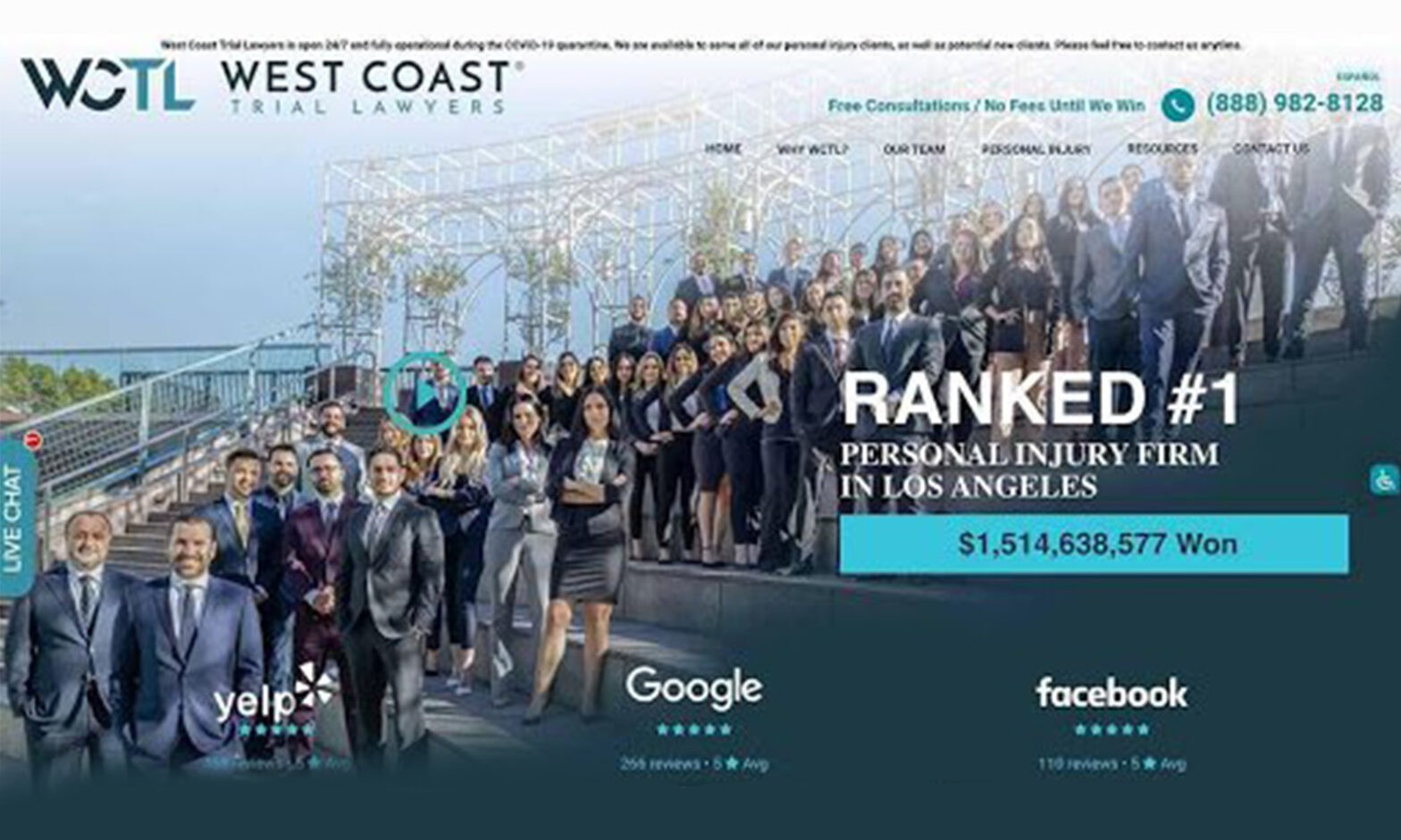
With a clean design and easy-to-understand navigation, the West Coast Trial Lawyers homepage is a fantastic example of functionality. In the top right-hand corner, the navigation bar gives users quick access to key pages. The law firm’s phone number is prominently displayed, so even a cursory glance ensures that a user can spot the contact information.
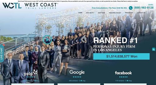
As your eye moves around the rest of the home page, you see that the firm wastes no time showcasing their confidence in their abilities. Rankings from Google, Yelp, and Facebook are front and center, with rotating client testimonials directly below. Additionally, a color-blocked box highlights the firm’s amount of money won in trials so far, adding a specific wow-factor to the website.
Finally, users can do a quick read-through of the benefits of choosing the West Coast Trial Lawyers, which helps the firm stand out from any other options the user may be considering. And of course, positioning the promise for a “Free consultations/no fees until we win” in a floating bar that follows you as you scroll makes sure that the user knows they have nothing to lose by contacting the firm.
McClellan Law Firm
The website for the McClellan Law Firm is a shining example of the power of thoughtful details, from the excellent portrait photography to the buttons’ rollover effects. The color scheme exudes a sense of professionalism, while attention-grabbing headlines inform the user that this firm is one that has a proven track record of success.
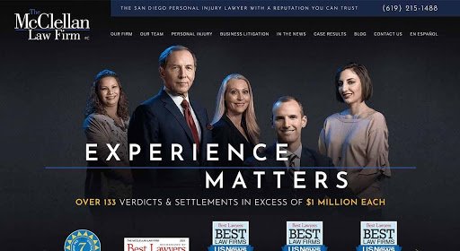
Much like the previously-mentioned site, McClellan Law Firm’s home page is designed to direct the user to their biggest achievements: multiple awards and honors from industry publications, as well as the millions of dollars they’ve won on behalf of their clients.
Everything about this page is tastefully done, including the letter spacing, font choices, and the incorporation of images. Contact information is easily accessible, and the homepage includes a straightforward contact form for users interested in the free consultation.
Ogilvie
When it comes to designs for attorney websites, Ogilvie is one that completely breaks the mold in a wonderful way. The site is modern and stylish, commanding attention and immediately showing the user that Ogilvie isn’t just any old law firm. Striking in its simplicity, the aesthetic design makes a strong first impression on both desktop and mobile devices.
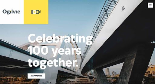
Large images take up a considerable amount of page real estate, balanced by minimal but effective text. For many users, this approach can be a savvy way to demonstrate that Ogilvie is a firm that doesn’t waste time with too much talking; instead, they get straight to the point. Depending on your target audience, this could be a smart approach to establishing a unique branding.
There are several clear CTA (call to action) buttons throughout the site, each of which highlights in yellow when you hover over it. The effect both draws the eye and encourages the user to click, following a path that will ideally lead them to the point of conversion.
Jones Foster
The sleek, minimalistic design of the Jones Foster firm website brings new meaning to the concept of understated design. Presented entirely in grayscale, the site communicates a feeling of sophistication and luxury, which is fitting when you consider its target audience of high-income business professionals.
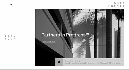
One of the benefits of such a clean website is the impressively-fast loading time, which contributes to a positive user experience. Also, because site navigation is based on a grid system, the majority of users will have no trouble finding the information they need. The site is contemporary, upscale, and refined, successfully conveying the law firm’s branding.
Arnold & Itkin Trial Lawyers
As practitioners of maritime law, the attorneys at Arnold & Itkin already stand out from competitors. Even so, their website design makes sure to capitalize on their highly specialized areas of practice, from the color scheme and images to the subtle animations.
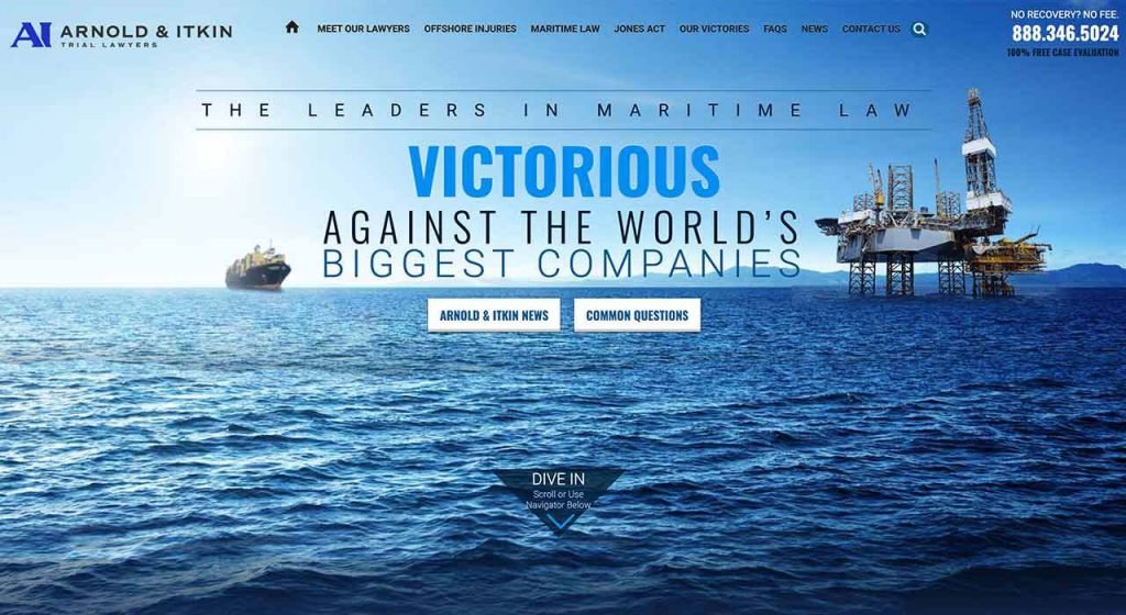
You can’t help but be immediately drawn to the word “victorious” because its font size , color, and position make it virtually leap off the page. From the second the page loads, you’re already associating victory with the Arnold & Itkin law firm – and that’s no accident. As the centralized text refreshes, simple but effective descriptors appear, communicating that this is a highly successful and confident firm.
One of the unique features of the design of this legal page is the inclusion of video players. One player highlights one of the firm’s most notable cases, while others are used to deliver client testimonials. Not only does this have the effect of humanizing the firm, but it also leaves a lasting impression on the user. Finally, having a wealth of information just a click away ensures that the user will have no difficulty in locating the details they’re looking for, increasing the odds that they’ll continue to move forward towards building a relationship with the firm.
Connect with Design Professionals for Help with Your Attorney Website
One of the most important things you’ll do for your business is investing in a high-quality, well-designed website, no matter what industry you’re in. But for law firm websites, building a professional, distinctive site is especially imperative.
V Digital Services has the expertise and skill necessary to design, build, and launch your website, helping your law firm get on firm ground in the digital landscape. A solid online presence can help you grow and expand your practice, putting you in the position to achieve your goals and find long-term success.
Together, we can combine your firm’s brand identity with our creativity and technical ability, resulting in a website that exceeds your expectations.
Contact the V Digital Services team for a free quote for your website build today.
Featured Image: Sergey Nivens /Shutterstock

 PREVIOUS
Toda persona que haya sufrido un accidente sin ser el responsable, tiene derecho a demandar una compensación por el daño ocasionado. Si este es tu caso, en Abogados de Accidentes Ahora en San Bernardino, contamos con un equipo de abogados con amplia experiencia, que puede defenderte y ayudarte a obtener una indemnización.